Life x Kleid Noble Notebook: The Worst Good Notebook
About a year ago, I bought a Kleid A5 notebook with a 2mm grid. It was smaller–32 sheets/64 pages–but that was fit-to-purpose for my intended application. I was sketching out ideas I wanted to come back to repeatedly, with some diagrams and flowcharts. It was to compliment my other notebooks, and wanted to be able to cycle it a bit quickly, making the page count a feature.
There was a lot I liked about it. I liked the look of the navy blue cardstock cover. The paper was a good weight, and was fountain pen friendly–it was smooth though a bit of tooth, and no show-through, bleed-through, or feathering. It was checking a lot of boxes for me.
I was intrigued by the 2mm grid. It was fine enough to scale things I was drawing. I was intrigued by the potential to modulate my writing–using more or fewer boxes to manage the size of my writing. The density of the lines had the effect of making it somehow lese obvious than a 5mm grid.
I put it on my list of “notebooks to try.”
Life x Kleid Noble Notebook
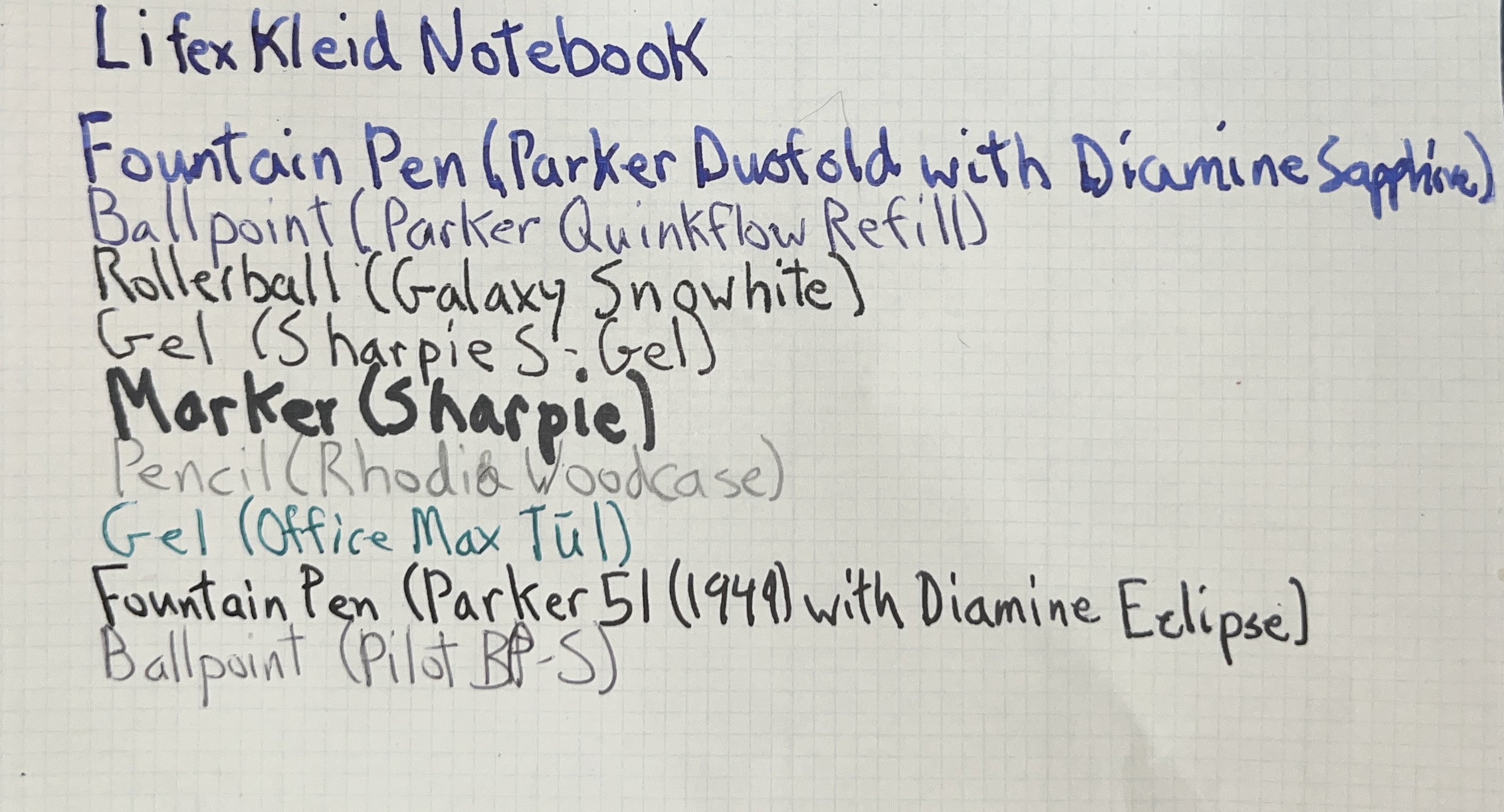
While visiting an out-of-town stationary shop, I came across the Life x Kleid Noble Notebook A5 notebook. This was a collaboration between Kleid (I can’t find a website as of this writing) and Life stationary companies. It appears to be made primarily by Kleid, as it has a lot more of the features of their products. At 100 sheets/200 pages, it met my criteria of for a journal. Like the earlier notebook, it had the 2mm grid layout. I decided to get two: one with a navy cover; the other, olive.
I finished the first after about three months, and have moved on to the second. I think it’s fair to say this is a long term review. While there is a lot I like about it, there are plenty of things I don’t. It’s not a bad notebook, like, say, a Moleskine; it just has come characteristics that made it less-than-suitable for me. I’ve come to think of it as the Worst Good Notebook.
Paper
The paper itself is great. At 84.9 gsm. This is comperable to my current go-to, all-purpose paper, Midor MD (80 gsm), and a bit heavier than the my top fountain pen choice, 68 gsm Tomoe River. The navy cover had white paper with a light blue grid, and I was rather fond of it. The olive covered notebook’s paper had the same light blue grid, but cream paper. At first, this combination, in some lights, seemed to have a green hue. However, the longer I used it, the less I noticed it.
Overall, I’d describe the paper as fountian pen friendly, and took ink well. There is no show through, bleed through, or feathering. There is a bit of feedback, whcih seems to come from the printed grid.
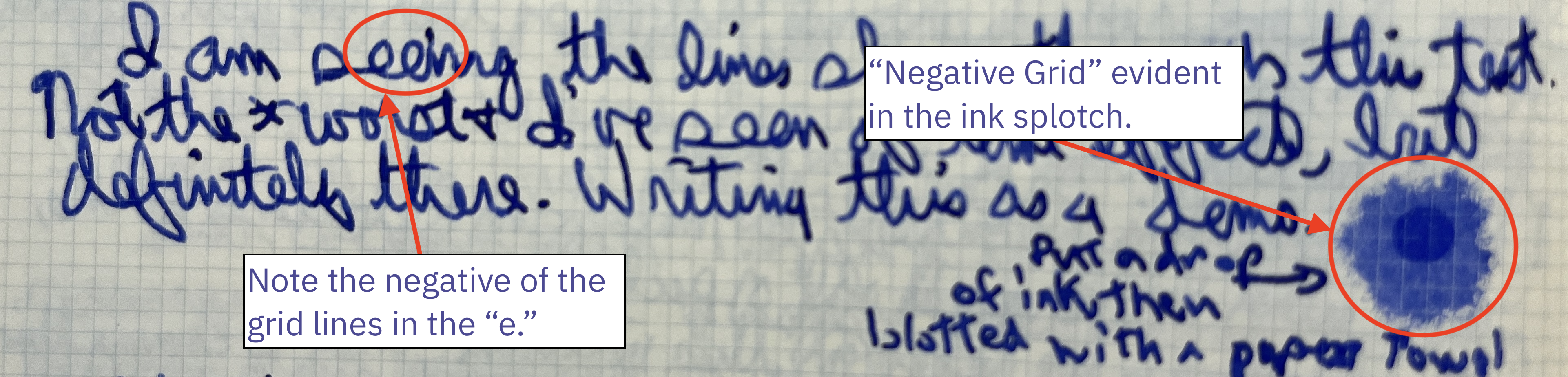
There was one small quibble. Sometimes the ink seems to skip the grid lines, and leave a white space. It’d been aptly described as the ink sliding off the line and pooling next to it. Often, it doesn’t happen (or isn’t’ noticeable). Other times, it’s just a little horizontal line–you’d almost think the pen skips, but it’s consistent across any letters that tall. I’ve had a few cases where I blot a blob of ink I accidentally drop, and see the grid pattern in white in the spot. I could not find any consistent patter relative to happening more or less frequently depending on the pen or ink. For personal writing, I would not say it is a dealbreaker, but anyone trying to use this for drawing might find this to be an issue.
I have not seen this effect with pencil and ballpoint ink.
2mm Grid
As I said, the 2mm grid intrigued me–it seemed like it could help modulate the size of my writing. With 7mm lines or a 5mm grid or dot grid, I could have lines of text that tall. If I wanted to go bigger or smaller, I could double it (to 10-14mm), or try to do somethign in the middle. With the smaller grid, I could keep the structure it offered while getting to choose any even-numbered line height. I gravite to around 6mm, but could do 4mm or 8mm with little effort.
Good in theory; not great in practice.
I decided for a baseline, I’d assume my lines would be three boxes, or 6mm tall. This fit my typical writing pretty well. When this was working well, it was a good height. I never felt like this was cramped, and never felt like the pens I was using (typically fountain pens, with nibs ranging from fine to broad). So far, so good.
As it turned out, I never really used a line height other than 6mm–not for any extended period. The times I did, mucle memory had me drifting to the 6mm standard, negating any benefit.
The lines being so close together, so small, and so light, it became challenging to consitently place my pen. Starting a page was easy, but I’d have to count down three boxes each line. If I wanted to skip a line between paragraphs, I’d have to count down the blank ones plus down to the next line (I settled on 4mm/two boxes between paragraphs).
Worse, as I worked my way across a page, I’d sometimes lose track of which lines was the bottom one. So, text might drift up, and compress down to 4mm. Or drift down, and leave a gap with the line above it. I tried to keep my eyes on where the prior word would sit, which would help. However, as a leftie, the pen blocked my view, and it required a fair amount of concentration. When I hit moments where I needed to write a big burst of thought, I’d drift up or down.
Conclusion: for journaling, a 2mm grid was not for me.
Build
On first encountering the notebook, the build quality was similar to other A5 soft cover notebooks, like the Midori MD or the JetPens Kanso Noto. It held up well to days of being pulled in and out of a bag, written on, etc. The binding never broke, and the cover stood up to abuse. It did not have a ribbon bookmark, which is hit-or-miss for softcover notebooks this size. It does not have a pocket (more typical on hardcover notebooks).
The Noble Notebook collected its paper into four signatures, as though they took several of the first Kleid notebook I had and joined them together. Most similar notebooks have a relatively larger number of smaller signatures. On the surface, it doesn’t seem like it would matter. I foudn this made it hard at times to keep the notebook open. I beieve it also caused, over time, the edge to fall out of alignment. This may happen with other notebooks, but it seemed more pronounced.

Further, between the first and second, and third and fourth signatures, there was a piece of cardstock that came about a centimeter into the book. I came to call this “The Rib.” The Rib appears to be how the cover was joined in to the book. It made writing near the inner edge of notebook adjacent pages a bit difficult–it took three-to-five sheets to reduce its impact.
Overall, it’s built reasonalby well, but has a few attributes I found to be, if not a problem, a bit annoying.
Conclusion
For certain, the 2mm grid layout is not for me, at least not for a journal. There may be other applications it is apt for, or other folks who may find it suites them. I think I will stick to other layouts (primarily a 5mm dot grid).
But most notebooks come in multiple layouts. Would I consider this notebook aside from that? There are a lot of quirks, like the Rib, that make me think I would not go out and buy one. At the same time, I would not pass on one if offered (or deeply discounted). It’s issues are more idiosyncrasies than actual concerns. But at that price point (or lower), thare are many notebooks of similar quality that I feel I can recommend with fewer reservations.
Personal Observation
I bought these notebooks while I still had about 10-15% left in their predecessor. Getting a replacement at this point, if I didn’t already have one on deck, was not unreasonable. At the time (something I wanted with no shipping or wait (and personally in need of a bit of retail therapy)), getting two made sense. Likewise, having tried a very similar notebook previously, it seemed low risk. While I wouldn’t say I lost, I think I learned a few things:
- If trying a new brand or model, it’s prudent to buy only one (or only one pack, if sold in a multi-pack).
- If it’s a new layout, only buy one. What works on one page may not work out over one hundred.
- If it’s a new brand or layout for the intended application, only get one. What works for a pocket notebook may not be the same for a journal.
- As a stationary geek, even if it’s a notebook I know and love, absent a good deal, I should keep only one (or one pack) of a notebook “on deck.” If I see something I want to try, it’s bad enoguh thinking I have to get through what I have, or even that plus on deck. While I might keep the spare in reserve to try something new, it’s a bit harder to justify keeping two (or more) in reserve.
There are currently no comments on this article, be the first to add one below
Add a Comment
Note that I may remove comments for any reason, so try to be civil. If you are looking for a response to your comment, either leave your email address or check back on this page periodically.